|
|
Posted on 11-25-12, 09:51 am
|
 Birdo BirdoKarma: 2799 Posts: 343/2091 Since: 06-26-11 |
I think storment is offering to do custom music for people, maybe you could ask him?
And well, everybody knows that NSMB is made by Nintendo and the whole game is re-made in this so... |
|
|
Posted on 11-25-12, 09:01 pm (rev. 3 by ImageBot on 11-21-16, 02:34 am)
|
 Birdo BirdoKarma: 3336 Posts: 993/2026 Since: 06-28-11 |
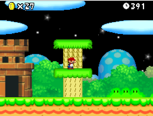
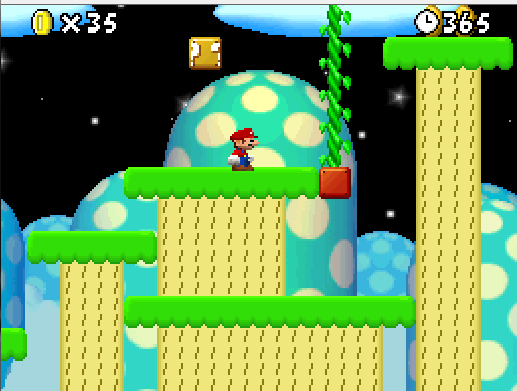
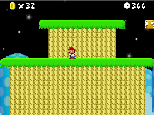
Posted by ray Lol in a few minutes Mega-Mario will come and tell you that you aren't allowed to remove nintendos copyright xD Otherwise it looks good. Well I wasn't sure to do it, but in the end it would have looked weid that nintendo made my hack lol, but splash screen and credits are still the same. Anyway thanks ^^ Posted by Hiccup I think storment is offering to do custom music for people, maybe you could ask him? I would, but he is busy now doing custom music for Anyway, I decided to change some graphics because they dont look that well IMO. Here is the OLD design for the grassy platforms: (SMB1 style on bottom and lost levels on top) And here is the new design of both of them: Which design is better? _________________________ |
|
|
Posted on 11-25-12, 10:32 pm
|
 Giant Red Koopa Giant Red KoopaKarma: 851 Posts: 78/1315 Since: 11-12-12 |
The new designs are ALOT better! Cant wait for this to be out!
|
|
|
Posted on 11-25-12, 11:34 pm
|
 Buzzy Beetle Buzzy BeetleJust watching... Karma: 503 Posts: 330/386 Since: 07-01-11 |
Posted by Hiccup I think storment is offering to do custom music for people, maybe you could ask him? offtopic: Oh yeah? since when? Why does everyone think that? _________________________ |
|
|
Posted on 11-26-12, 02:05 am
|
 Koopa KoopaKarma: 172 Posts: 20/106 Since: 10-20-12 |
|
|
Posted on 11-26-12, 08:23 am
|
 Birdo BirdoKarma: 2799 Posts: 348/2091 Since: 06-26-11 |
Sorry, I just got the impression.
Nobody is going to order you to do it  . .
|
|
|
Posted on 11-27-12, 05:47 am (rev. 3 by ImageBot on 11-21-16, 02:34 am)
|
 Birdo BirdoKarma: 3336 Posts: 997/2026 Since: 06-28-11 |
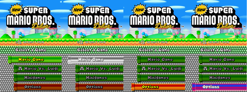
New title screen menu!
(thanks to RicBent for telling me where the files are) The white pipe image is when you tap on any of the green pipes, and the pinky/blue one is when you tap on the red pipe 
_________________________ |
|
|
Posted on 11-27-12, 10:50 am
|
 Super Mario Super Mario( ͡° ͜ʖ ͡°) Karma: 10202 Posts: 2927/4459 Since: 06-08-11 |
Hmmm. Looks good
 Maybe you need to make these graphics more NSMB-like. They're too high contrast too. |
|
|
Posted on 11-27-12, 07:50 pm
|
 Red Goomba Red GoombaKarma: -17 Posts: 24/40 Since: 10-31-12 |
|
|
Posted on 11-27-12, 07:53 pm
|
|
Doesn't actually do anything.
Karma: 3042 Posts: 57/653 Since: 10-22-12 |
|
|
Posted on 11-28-12, 07:17 am (rev. 1 by ImageBot on 11-21-16, 02:34 am)
|
 Birdo BirdoKarma: 3336 Posts: 1000/2026 Since: 06-28-11 |
Sorry for that. The link has been fixed now.
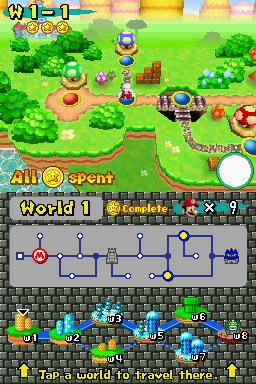
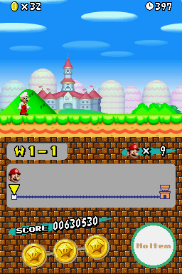
Posted by Dirbaio Hmmm. Looks good  Maybe you need to make these graphics more NSMB-like. They're too high contrast too. I wish I could. Editing that white brick textures is hard, since its palette is linked to the MvL bricks. Also they are high contrast because they are the original SMB3lost levels graphics  Also here is the new file selection screen: Looks small because its a screenshot of the actual ds size screen. It looks better when you have a real DS or resize the emulator window. And here is the begging of editing the bottom screens backdrops. I have made it possible so the backdrop changes between overworld and level. Here is the default backdrop in the overworld: And here is the default backdrop in a level: All backdrops will have this feature. (also this is my post 1000  ) )
_________________________ |
|
|
Posted on 11-28-12, 07:35 am
|
 Fuzzy FuzzyFull mod Karma: 1183 Posts: 599/785 Since: 06-28-11 |
I like your new backgrounds, but I definitely agree that they are too high contrast. They look good, but backgrounds are meant to blend in and not really be noticeable. Try decreasing the contrast and perhaps fading them to white a bit and see how it looks in game. And congrats on 1000 posts 
|
|
|
Posted on 11-28-12, 07:47 am
|
 Birdo BirdoKarma: 3336 Posts: 1001/2026 Since: 06-28-11 |
Posted by Piranhaplant I like your new backgrounds, but I definitely agree that they are too high contrast. They look good, but backgrounds are meant to blend in and not really be noticeable. Try decreasing the contrast and perhaps fading them to white a bit and see how it looks in game. And congrats on 1000 posts  Alright I see what can I do with. That is actually the NES palette used. That may be why. (does the SMAS blocks needs a tone done in contrast too?) thanks 
_________________________ |
|
|
Posted on 11-28-12, 08:10 am (rev. 1 by ImageBot on 11-21-16, 02:34 am)
|
 Fuzzy FuzzyFull mod Karma: 1183 Posts: 600/785 Since: 06-28-11 |
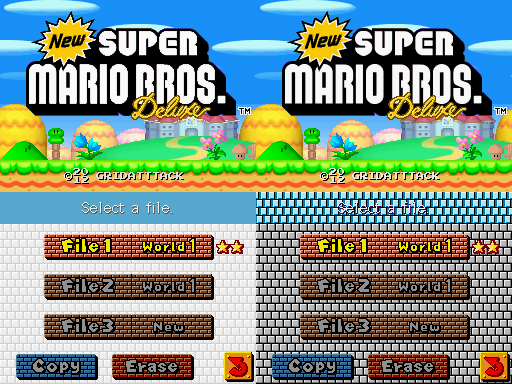
I honestly think all of the backgrounds need to have less contrast. Here's an example comparison shot of the file select screen with a lower contrast, brighter background. I also changed the top bar to a solid color because it is almost illegible on your screen. |
|
|
Posted on 11-28-12, 08:26 am (rev. 3 by ImageBot on 11-21-16, 02:34 am)
|
 Birdo BirdoKarma: 3336 Posts: 1002/2026 Since: 06-28-11 |
Posted by Piranhaplant I honestly think all of the backgrounds need to have less contrast. Here's an example comparison shot of the file select screen with a lower contrast, brighter background. I also changed the top bar to a solid color because it is almost illegible on your screen. You know...the longer I see the white one the more I like it  Ill change it then. I also will try to add contrast to those bricks in the select file area. But its worth mentioning that brick patter I used is unused on the background files, so nintendo probably intended to use the one im using now.  Thanks anyway^^  EDIT: here is the contrasted SMAS grey bricks. 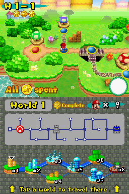 How does it looks now? _________________________ |
|
|
Posted on 11-28-12, 12:02 pm
|
 Fuzz Ball Fuzz BallKirbyFanatic64 (LOL) Karma: 1386 Posts: 689/950 Since: 11-13-11 |
That's better with modified contrast, it is more blending with the screen overall. Nice, keep it up.

_________________________
Great games must be fun, not fancy.
Music Hacker needed! PM me if you wish!
|
|
|
Posted on 11-28-12, 01:21 pm
|
 Giant Red Koopa Giant Red KoopaKarma: 851 Posts: 86/1315 Since: 11-12-12 |
^ I agree!
It makes it look nicer with all the other stuff on it! |
|
|
Posted on 11-28-12, 09:46 pm (rev. 1 by ImageBot on 11-21-16, 02:34 am)
|
 Birdo BirdoKarma: 3336 Posts: 1004/2026 Since: 06-28-11 |
|
|
Posted on 11-28-12, 09:54 pm
|
 Porcupo PorcupoCaptivated by Persona 4 Karma: 605 Posts: 229/306 Since: 01-06-12 |
I like the background itself
 , but I think the stones are a bit too small, and with the black border, it becomes a bit busy and distracting. So, it's probably the best to remove the black border or make the stones a bit bigger , but I think the stones are a bit too small, and with the black border, it becomes a bit busy and distracting. So, it's probably the best to remove the black border or make the stones a bit bigger  And I dunno if more people think this, but maybe you should change the stone color, some icons become hard to see with the green texture 
_________________________ I apologize to everyone for my horrible English. |
|
|
Posted on 11-28-12, 09:57 pm (rev. 3 by ImageBot on 11-21-16, 02:34 am)
|
 Red Goomba Red GoombaKarma: -17 Posts: 27/40 Since: 10-31-12 |
Posted by gridatttack Thanks all! ^^ Also I got this new bottom screen image. 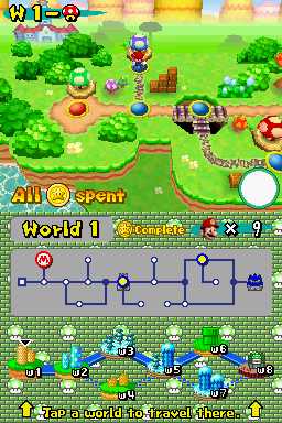 How does it looks? Should I remove the black outlines of the brick texture? The World 1,2 and 3 equal? The World 6 its world of pipes? The World 3,5 and 7 equal? Sorry sorry for asking so much is that the game is not patched in .nmp ______________________________ Sorry for the bad english i am spanish.  |

