|
|
Posted on 05-21-16, 12:52 am
|
 Roy Koopa Roy KoopaThe guy who does things.  Karma: 12774 Posts: 2068/2796 Since: 07-01-11 |
Much thanks to New Super Mario Bros.: Clone Tag Team 1+2 / New Super Mario Advance + Take 2 / Super Mario: Endless Earth My two greatest assets have been mental stability and being, like, really smart. |
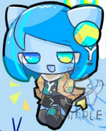
| xKitten |
Posted on 05-21-16, 12:58 am
|
 Koopa Koopabanned: childish fight with Super-toad 65  Karma: 265 Posts: 33/101 Since: 05-14-16 |
So do I, that looks amazing. Nice job, grid and MarioFanatic.
_________________________ It's time we take a stand. |
|
|
Posted on 05-21-16, 06:04 am (rev. 1 by
|
 Karma: 472 Posts: 56/139 Since: 04-08-16 |
I agree with xKitten, this is beautiful And it just works perfectly with the New Super Mario Endless Earth image EDIT: I did not expect this layout to use layouts : O
The Legendary Sprite 326:
 |
|
|
Posted on 05-21-16, 12:40 pm
|
 Paragoomba Paragoomba Karma: 240 Posts: 35/69 Since: 02-01-14 |
I just edited my SMWC Layout a bit to fit this website. What do you think about it?
_________________________ 
|
| Sherry_ |
Posted on 05-21-16, 12:55 pm (rev. 3 by Sherry_ on 05-22-16, 09:48 am)
|
|
Karma: 1430 Posts: 224/355 Since: 05-26-15 |
The layout is well done. But I suggest you to remove the
|
|
|
Posted on 05-21-16, 04:03 pm (rev. 3 by
|
 Birdo Birdo Karma: 3336 Posts: 1844/2026 Since: 06-28-11 |
Actually, that layout is fine. I use a dark color scheme and I see no problem.
It works fine on the bright NSMB grassland theme. Speaking of which, I switched to that theme and found that The same thing happens to Sherry_, except only in the topbar 2. _________________________ |
|
|
Posted on 05-21-16, 04:55 pm (rev. 1 by
|
|
Karma: 472 Posts: 57/139 Since: 04-08-16 |
Gonna fix both of the layouts Also, I never understood people saying that that kind of layout is hurting their eyes... 
The Legendary Sprite 326:
|
|
|
Posted on 05-21-16, 06:17 pm
|
|
Not a hacker
 Karma: 158 Posts: 74/153 Since: 04-05-16 |
The quick brown fox jumps over the lazy dog
The quick brown fox jumps over the lazy dog The quick brown fox jumps over the lazy dog The quick brown fox jumps over the lazy dog The quick brown fox jumps over the lazy dog The quick brown fox jumps over the lazy dog Posted by lorem ipsum The quick brown fox jumps over the lazy dog _________________________ Discord server |
|
|
Posted on 05-21-16, 07:09 pm
|
 Nipper Plant Nipper Plant Karma: 949 Posts: 73/403 Since: 11-20-15 |
My blue star layout here.
_________________________ 
|
| Sherry_ |
Posted on 05-22-16, 09:45 am (rev. 2 by Sherry_ on 05-29-16, 08:36 am)
|
|
Karma: 1430 Posts: 227/355 Since: 05-26-15 |
Here's my new layout  . It seems to work in every NSMB Theme, except in NSMB Winter Snow, where the URL links are light blue (I'm too lazy for add the !important). . It seems to work in every NSMB Theme, except in NSMB Winter Snow, where the URL links are light blue (I'm too lazy for add the !important).Code Test: This is a code Font Test: Bold Italic Underlined Superscript Subscript Quote Test: Posted by Gardevoir Posted by Darkrai Oh, no! And URL test: Youtube What do you think? 
|
|
|
Posted on 05-22-16, 09:59 am
|
|
Newcomer
 Karma: -2 Posts: 3/6 Since: 05-21-16 |
  I think it looks pretty nice. I like how the adjacent corners are different sizes in the main post box. Over here I've got my own layout, of course. Took a bit of finagling, some help, and looking at other people's layouts, but I think it looks pretty good, myself. Posted by Benjamin I thought you said you were SURE I was the one! Posted by White Well, it was more of a guess... Bringing incense under |
| Thierry |
Posted on 05-22-16, 01:23 pm
|
|
この記号は… 解読できないよ…
 Karma: 6269 Posts: 1856/2817 Since: 01-17-13 |
Posted by Hypernova99 Bold Italic Underlined Superscript Subscript Unless you have a custom font (which is not the case here), showing these is pointless. Especially when your profile already does it. This is just my opinion. ______ I have different post layouts on three boards. I will put them all on a single page for you to see. |
| Sherry_ |
Posted on 05-22-16, 01:31 pm (rev. 4 by Sherry_ on 05-22-16, 02:05 pm)
|
|
Karma: 1430 Posts: 228/355 Since: 05-26-15 |
No, Thierry, it have custom fonts (Trebuchet MS), but you don't view it because you're on your 3DS/mobile.
On the mobile phones the font isn't shown, too. |
| Thierry |
Posted on 05-22-16, 02:25 pm (rev. 1 by ImageBot on 11-21-16, 03:20 am)
|
|
この記号は… 解読できないよ…
Karma: 6269 Posts: 1858/2817 Since: 01-17-13 |
It wasn't only directed at you. Notice how everyone was doing it.
Also, by a 'custom font', I meant a linked font such as this. 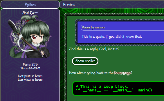 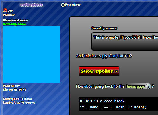 In which case there is a point in doing this (IMO). |
|
|
Posted on 05-22-16, 10:52 pm
|
|
Birdo Karma: 3336 Posts: 1845/2026 Since: 06-28-11 |
| Yami |
Posted on 05-27-16, 10:06 pm
|
|
(ーωー。)
 Karma: 721 Posts: 98/240 Since: 08-12-13 |
I decided to go more Touhou Project style. Honestly, I feel like I fucked it up, compared to most of you, but it's still better than an all Pink and Black one I previously had on Kuribo64 and DSHack.org. _________________________ |
| Thierry |
Posted on 05-27-16, 10:10 pm
|
|
この記号は… 解読できないよ…
Karma: 6269 Posts: 1877/2817 Since: 01-17-13 |
Eh, it looks pretty nice, but it lacks readability a bit.
|
| Yami |
Posted on 05-27-16, 10:15 pm
|
|
(ーωー。)
Karma: 721 Posts: 99/240 Since: 08-12-13 |
I know, maybe I should make it less transparent? I think I'll do that on only one of the 3 Sites for now, editing the exact same CSS Code on 3 Forums is a bit exhausting. _________________________ |
| TheKoopaKingdom |
Posted on 05-27-16, 10:17 pm
|
 Shyguy Shyguy Karma: 463 Posts: 60/83 Since: 02-12-15 |
You can host a style, link to that, and just edit that.
_________________________ Website | Twitter MK8 Modding Central |
| Thierry |
Posted on 05-27-16, 10:22 pm
|
|
この記号は… 解読できないよ…
Karma: 6269 Posts: 1878/2817 Since: 01-17-13 |
Host it on dropbox or something. You can edit it from there, I think.
Also instead of making the element less transparent, you can just slightly alter the background to make it less bright. |