| Thierry |
Posted on 11-07-13, 01:19 pm (rev. 2 by ImageBot on 11-21-16, 02:39 am)
|
|
この記号は… 解読できないよ…
 Karma: 6269 Posts: 516/2817 Since: 01-17-13 |

 It's blurred for a reason. But I'll improve this. |
|
|
Posted on 11-07-13, 04:31 pm (rev. 1 by
|
|
a
 Karma: 1589 Posts: 638/1290 Since: 02-12-13 |
OK, thanks.
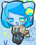
I wonder why, when we resize it, it becomes blurred  Also, which one do you guys like? P-Wing's or mine? |
| Thierry |
Posted on 11-07-13, 05:22 pm (rev. 2 by Thierry on 11-07-13, 06:44 pm)
|
|
この記号は… 解読できないよ…
Karma: 6269 Posts: 517/2817 Since: 01-17-13 |
Posted by hamza62240 I wonder why, when we resize it, it becomes blurred Because if it's not blurred, we can see then pixels. It's not beatiful! 
|
|
|
Posted on 11-07-13, 07:44 pm
|
|
a
Karma: 1589 Posts: 639/1290 Since: 02-12-13 |
No, I think, that the reason it's blurred is that the pixels are the size of the monitor's pixels. So, if we make them short, it will end up that the pixels can not get smaller then the computer pixels (obviously), so the pixels stay big. And then it looks blurred. I think that's why.
|
| Thierry |
Posted on 11-07-13, 08:13 pm (rev. 1 by ImageBot on 11-21-16, 02:39 am)
|
|
この記号は… 解読できないよ…
Karma: 6269 Posts: 518/2817 Since: 01-17-13 |
Is this better?
 |
|
|
Posted on 11-07-13, 08:29 pm (rev. 4 by
|
|
a
Karma: 1589 Posts: 640/1290 Since: 02-12-13 |
It looks a bit hollow
Like, up.Also, do you guys like P-Wing's logo or mine? EDIT: Oops, it's fine. Just my eyes. Anyway, you fixed so much of it, Thierry, you get all the credit =P |
| Thierry |
Posted on 11-07-13, 09:01 pm (rev. 8 by ImageBot on 11-21-16, 02:39 am)
|
|
この記号は… 解読できないよ…
Karma: 6269 Posts: 519/2817 Since: 01-17-13 |
Posted by hamza62240 Also, do you guys like P-Wing's logo or mine? Your one is beatiful. And I improved it, but not only the "New". But somes changes aren't viewable.  I like P-wing's image too. The silver star coin is good.  |


|
|
Posted on 11-07-13, 09:28 pm, deleted by
|
| shibboleet |
Posted on 11-07-13, 10:05 pm, deleted by
|
| Thierry |
Posted on 11-07-13, 10:07 pm, deleted by
|
|
|
Posted on 11-07-13, 10:50 pm
|
 Super Mario Super Mario( ͡° ͜ʖ ͡°) Karma: 10212 Posts: 3878/4459 Since: 06-08-11 |
Quoting the post so people can see it:
Posted by hamza62240 Thanks. Now, the competition begins! Which one is the best? Choose a logo from the list Thierry gave in the post above this post! Options: SpongeTown's logo P-Wing's logo hamza62240's logo: 1st logo, 2nd logo, 3rd logo MarioFanatic64's logo: 1st logo, 2nd logo, 3rd logo Thierry's logo (NOTE: Don't vote for the my logos he fixed! Only vote for his logo.) So let the competition begin!  Nope nope. You don't have the authority to decide to start a competition, assuming that the winner will be chosen as the official logo in the header. That's not your decision, but the staff's. BTW, I'm not okay with these logos. I said I'm okay with changing the logo, but only for a better one... I think we should first try to make a good logo of only the "The NSMB Hacking Domain" part, in good resolution (1000 pixels?), with a transparent background. And after, make banners with it that could go on the board. |
| Thierry |
Posted on 11-07-13, 10:54 pm
|
|
この記号は… 解読できないよ…
Karma: 6269 Posts: 521/2817 Since: 01-17-13 |

Mine is correct? It look like the old one. |
| shibboleet |
Posted on 11-07-13, 10:56 pm
|
 Mole MoleNormal user Karma: 2023 Posts: 99/359 Since: 07-08-12 |
BTW, I'm not okay with these logos. Did you like, even read this at all? He said that the ones that are already posted aren't okay with him. |
|
|
Posted on 11-07-13, 11:02 pm
|
|
a
Karma: 1589 Posts: 642/1290 Since: 02-12-13 |
Augh.
Dirbaio, I don't think it's such a good idea to just have the old NSMBHD logo there It's unoriginal and boring.  But, if you mean that we need to give the logo of NSMBHD, i'll give it. But, I think my banner is fine. It looks pretty good. But if you want a better one then I can give you, Dirby. And sorry Dirbaio, I wont host competitions without asking staff first. :p LOL: Ninja'd by MrRean.  Anyway, why don't you like these logos, Dirbaio? Is there something wrong with them? Anyway, why don't you like these logos, Dirbaio? Is there something wrong with them?
|
| Thierry |
Posted on 11-07-13, 11:03 pm (rev. 1 by Thierry on 11-07-13, 11:03 pm)
|
|
この記号は… 解読できないよ…
Karma: 6269 Posts: 522/2817 Since: 01-17-13 |
I said I'm okay with changing the logo, but only for a better one... Did you like, even read this at all? Mine is maybe better, that's why I ask him. EDIT: Ninja'd by Hamza |
| shibboleet |
Posted on 11-07-13, 11:04 pm (rev. 1 by shibboleet on 11-07-13, 11:05 pm)
|
|
Mole Normal user Karma: 2023 Posts: 100/359 Since: 07-08-12 |
I said I'm okay with changing the logo, but only for a better one... A better one that isn't already posted.  The frickin point is, dirbaio means that he wants a new logo, but not the ones that are already posted, because it's just a repeat of the same damn logo 10000 times and with a NSMBe background or something unoriginal like that. |
|
|
Posted on 11-07-13, 11:06 pm (rev. 1 by
|
|
a
Karma: 1589 Posts: 643/1290 Since: 02-12-13 |
LOL NINJA'D CHAIN,
1. MrRean ninjas me 2. I ninja Thierry at the same post. :p Anyway, urmm... Why don't you like the logos? I mean, is it because the background in the level is all same? Like in underground? Or what is it?!? EDIT: OK, MrRean, what do you mean it's a repeat of the same logo? o.O It's different. OK, I will change the background to a castle or forest or somethin, but I don't think it's a repeat. |
| Wesley |
Posted on 11-07-13, 11:14 pm
|
|
Inactive, don't bother
Karma: 1285 Posts: 206/377 Since: 10-07-12 |
Those logo's are having the same layout as the old one.
If I understand Dirbaio right he want something totaly new and origenal. |
|
|
Posted on 11-07-13, 11:16 pm (rev. 3 by ImageBot on 11-21-16, 02:39 am)
|
|
a
Karma: 1589 Posts: 644/1290 Since: 02-12-13 |
Same layout? OK, I'll make the underground in the bg something else.
But, does anyone know a way to remove those large block-grid things? The white lines? Which are like huge blocks? Grid? That, is there any way to remove it? EDIT: OK, I got a logo. Is this OK?: 
|
| Garmichael |
Posted on 11-08-13, 12:41 am
|
 Ninji NinjiRetired staff  Karma: 601 Posts: 221/229 Since: 06-30-11 |
Some of these logos are really, really bad.
I'm noticing that the NSMB:HD text is really pixelated. You want to find the largest possible image you can for that logo and shrink it down. Never, ever, under any circumstance, enlarge an image or distort the dimensions. That's where those pixels are coming from. The framing also needs a lot of work in these. I can't give any tips on that, except that you have to use your artistic eye. Cropping a character takes real consideration. In the one with the Koopa, he's cut off half way through his shoes, which is super awkward. You're better off cutting him off at the waste, so you see him like a bust. Cutting off his head is also real close to the top of the border. If you want to show the whole head, give him a bit of room between the top of his head and the top of the image. In this last one with Mario on top of the forest scene with the spiders, that cut where his fist is is awkward. It would look better if the his face took up more real estate on the image, and his head is cut off right about in middle of the bill for his cap. Showing part of the M and cutting it off through that will look like he's missing something, so you want to go between that, and above his face. None of his face skin should be cut. Really though, what's the point in changing the logo if all you're doing is copying the current logo but with different art in it? If all you guys want is different backgrounds with different characters on them, I can whip up a bunch of them by the end of the night. If you guys REALLY want a new logo, then.. MAKE. A. NEW. LOGO. |