| coolas1 |
Posted on 07-15-11, 11:03 am (rev. 2)
|
 Porcupo PorcupoDid you win the game? Karma: 226 Posts: 15/322 Since: 06-28-11 |
Posted by Dirbaio Also, Garmichael, links in your layout appear white when you hover them, which makes them become invisible against the white BG. You should probably fix that.  ) )Maybe its firefox 3.0 that does this... I'll Check on linux soon. No It looks fine. BTW I've finished playing through piranaplants level and then I got halfway through Area 3 of Gridattacks level and Died.  Do I have to finish the level completely, or can I just go with what I have done... Posted by dirbaio
I'll maybe try them out and do critiques too (If it's allowed without having paricipated, of course) I'm fine with that. |
|
|
Posted on 07-15-11, 11:23 am
|
 Super Mario Super Mario( ͡° ͜ʖ ͡°) Karma: 10222 Posts: 303/4460 Since: 06-08-11 |
It displays wrong with an old Firefox 3.6 in Linux.
|
| coolas1 |
Posted on 07-15-11, 11:56 am (rev. 4)
|
|
Porcupo Did you win the game? Karma: 226 Posts: 16/322 Since: 06-28-11 |
Posted by Dirbaio It displays wrong with an old Firefox 3.6 in Linux. Really??????? From your profile Brower: Firefox 3.6.13 on Linux They are the same right?? Or is it the Ubuntu build of Firefox. |
|
|
Posted on 07-15-11, 02:37 pm
|
|
Super Mario ( ͡° ͜ʖ ͡°) Karma: 10222 Posts: 304/4460 Since: 06-08-11 |
Oh, then it must be because I'm using the Mono Green theme.
Anyways, it probably happens with ANY dark-based theme... |
| Garmichael |
Posted on 07-15-11, 10:28 pm (rev. 2)
|
 Ninji NinjiRetired staff  Karma: 601 Posts: 42/229 Since: 06-30-11 |
Posted by Dirbaio There are many cool-looking levels here  I'll maybe try them out and do critiques too (If it's allowed without having paricipated, of course) Also, Garmichael, links in your layout appear white when you hover them, which makes them become invisible against the white BG. You should probably fix that. Sure, that sounds like a fine plan. More critiques of levels = level designers that get better at what they're doing. I've noticed GridAttack's levels have gotten a lot better since we started because of the critiques. |
|
|
Posted on 07-16-11, 12:30 am
|
 Birdo Birdo Karma: 3336 Posts: 54/2026 Since: 06-28-11 |
Posted by coolas1 Posted by gridatttack
I don't know if this is valid to do, but I would like to clarify some things. On the second area, after the autoscroll has finished, the screen wont go up, so in order to do so, you must enter the red pipe in order to appear in the same screen and make the camera go up. This is the only way I could fix this problem. I imported the level in W1-2 (I had Piranaplant's in W1-1) and it scrolled up fine. I do not see what is wrong Well, sometimes, after the auto scrolling stopped, the camera will go up. But after I finished the level and began testing it, it wont scroll. So I added the pipes, which in either cases you cant get stuck
_________________________ |
| coolas1 |
Posted on 07-16-11, 04:43 am
|
|
Porcupo Did you win the game? Karma: 226 Posts: 18/322 Since: 06-28-11 |
Posted by gridatttack Posted by coolas1 Posted by gridatttack
I don't know if this is valid to do, but I would like to clarify some things. On the second area, after the autoscroll has finished, the screen wont go up, so in order to do so, you must enter the red pipe in order to appear in the same screen and make the camera go up. This is the only way I could fix this problem. I imported the level in W1-2 (I had Piranaplant's in W1-1) and it scrolled up fine. I do not see what is wrong Well, sometimes, after the auto scrolling stopped, the camera will go up. But after I finished the level and began testing it, it wont scroll. So I added the pipes, which in either cases you cant get stuck I noticed that it only gets stuck if you did not come from the midway. If you came from the start of the level it gets stuck. If you come from the midway you do not get stuck. |
| Garmichael |
Posted on 07-17-11, 02:41 am (rev. 1)
|
|
Ninji Retired staff Karma: 601 Posts: 46/229 Since: 06-30-11 |
Piranhaplant
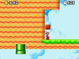
- The placement of the bricks right at the start feel weird. They're too low and the top row is uneven. Also, for some reason, I don't like mario starting under blocks. Dunno why. - There's a blind fall after the first power up. - The penguins are placed a little unfairly. The first one tends to hit me as I fall from the power up, and the third one is really hard to jump on top of because of the pipe. The second one is placed well and the notch in the ice is helpful and neat. - The first Star Coin is hard to get. about half the times I tried, I just barely missed the edge after wall jumping back. - The location of the pipe that shoots your left feels weird, like it's out of place. - I liked the notches above the donut blocks you could use for cover against the penguin up there. - The placement of the second arrow made out of blue coins makes it hard to grab them. The location of the pipe sort of just gets in the way again here. - I liked having to knock down the shelled critters from below, with the pits underneath as a hazzard. - I'm not a big fan of it when blocks just explode arbitrarily when you get near them. It feels flashy and unneccessary. - I liked the slide right after this part, where you can butt slide all the way to the pipe  - The room that fills with lava is a neat touch, and I like how the same pipe that takes you down takes you to the fire palce when you go back up after hitting the ? Button. Although, there's a way to not hit the ? button if you hold right. It may have worked best if you had the button raise the lava and destroy a barrier to a second pipe at the same time. - I tried lots and lots of times to get the last Star Coin in the lava ride and I was never fast enough to pull it off. - There's a blind fall after the two fire bars that dropped me in the lava a few times. It's also hard to tell where Dorrie is because the camera doesn't pan down enough. - The last area was tricky, but fun. The sense of urgency with the placement of the blocks and the parakoopas was nice. Challenge Met: 10/10 Design: A solid design. The levels aren't too long or too short and they flow nicely, with a few very interesting mini-areas. A couple blind falls and very difficult to obtain star coins hurt the overall score, though. 16/20 Polish: There are some strange object placement decisions. Some of the coins (specifically the ones that look like arrows) don't look as nice where theyre placed as they could have. The camera doesn't pan down low enough in the lava area to see Dorrie. 15/20 Total: 41/50 Cool As - I really like the spirit of this level. It's cool to unlock different parts of the level with the ? Buttons found. - The biggest problem with this level is that it's hard to figure out where to go next. - When parts of the level disappear to let you continue, the tiles look bad with their missing trim. You could have set it up so that the pieces that break apart as seperate tiles, so that when they disappear the remaining tiles still look good. Also, if you used blocks or tiles that look like they're supposed to disappear at some point, it would make finding the next place to go a lot easier. Check out this image:  As you can see, if the blue blocks vanished, the remaining tiles would still look good, AND, as the player visits this area, they can immediately tell that those blocks eventually vanish, so they can remember to revisit. - Putting collectables on inside of tiles is kind of messy. - The floating coins are silly when not under water. - Im not sure what gets rid of the first set of blocks. When I look at the level in the editor, I can tell what does it, but it's not obvious when I play it. Also, the blocks that disappear when you go up there are blocks you don't see until you get there. It's better design to let the player see the place they can't reach before giving them the way to reach it. Not only does it help the player understand what's going on, but it gives them something to think about as they're playing, and then when they solve it, they have a sense of accomplishment. - I really like the use of the enemy pipe generators. - In the underground area, I don't like the ? Blocks up against the celing. In fact, I don't like bricks there, either, except in specific cases (like a room full of bricks that you use a P Switch to get through. - I like the spots where you use the Bo-Bombs to clear the blocks! - I like how you transition the underground area to the icy area by gradually putting ice blocks in. It feels very natural. - The snow part was short and a little short and unexciting. - There's no way to reach the top of the flag. Challenge Met: 10/10 Design: Not a bad design overall. It was interesting and I liked the idea idea you had, but the exectution needed some work. The underground area was my favorite. 14/20 Polish:: The biggest polish problem is the way that the level looks bad when blocks disappear 12/20 Total: 36/50 gridatttack - First note: Too long! - Second note: There are numberous camera issues where the camera pans into an empty block, but then when you continue, the camera jerks into position. - Third note: Too many powerups. - The first part of the beach level is cool with the starman, but it's a little tough to reach the third star. Still, the continious starman thing is always fun. - There a few too many Hammer Bros in the second beach area. - It's weird how you break the blocks to get the first star coin. - In the start of the underground area, there's a block you can't get under if you're big. - The auto-scroll part was about five times longer than it needed to be, especially since most of it was just dodging sharks. - The issue you had with the screen not scrolling up was tricky, and I odn't know why it acted like that. But, as a designer, you should have found an elegant way around it where the player doesn't notice anything is messed up... Something as simple as putting a pipe there that leads you to an exit above that you couldn't get to without the pipe, since you had to go into the pipe anyway. - I really liked the part that leads to the second Star Coin. It felt like Metal Gear Solid, where you're waiting for sharks to turn around and sneak behind them. It was very fun. - The jungle area with the flowers in the foreground looked really nice. Is this a hack or was it in the actual game, too? - There's a part in the jungle where you you can slide down a hill, but if you slide too far, you automatically fall into poison, and then have to start too far back. The midway point would have been better put after the autoscroll is done. Also, grabbing that second star coin takes some time to do, and time intensive stuff should go before the midway point. - The vine ropes are also kind of tricky considering the cost is redoing some time intensive stuff. In fact, any point after this where you die is super super annoying. - The Giant Wiggler part was very fun. Some of the blocks here were too low, and mario gets squished and glitches through them, though. - Getting the third Star Coin was challenging. For one, you can't get it on your first play through because you don't know to keep a Bob-Omb. If you remember the next time, it's still hard to get it to work, and so at that point, you just want to die and try again, but then you're playing through a big chunk of the level again with some tricky rope jumping that kills you easily (forcing you to retry again). Challenge Met: 10/10 Design: The level is very, very long. It took me about 30 minutes to get through the whole thing, counting times I died. Dying was frustrating because of the time it takes to get through the level again. The individual sections of the level are very well done, though. I wanted to give you more points for design, but the length of the level sapped so much enjoyment out that it seriously hurts your score. A shorter level with the interesting stuff left in and the lengthy repedative stuff taken out would have gotten you 19/20. 15/20 Polish: The areas were visually interesting (even the underground areas with the limited tileset). Including the nice flowers in the forground of that one area was a nice touch. Overall, your visual design has improved greatly. The only problems with the polish in your levels are the way that the camera jerks around at certain key points, and the camera problem after the autoscroll part (that you should have designed around). 18/20 Total: 43/50 |
|
|
Posted on 07-17-11, 06:04 am (rev. 1 by ImageBot on 11-21-16, 02:08 am)
|
 Fuzzy FuzzyFull mod  Karma: 1183 Posts: 59/785 Since: 06-28-11 |
I'm going to disable my text glow from this post to avoid lag. Sorry if my critiques seem a little bit harsh. All of the levels were good, it's just easier to point out the negatives than the positives.
Cool As gridattack Garmichael |
| coolas1 |
Posted on 07-17-11, 07:37 am
|
|
Porcupo Did you win the game? Karma: 226 Posts: 23/322 Since: 06-28-11 |
gridatttack
-This level was way too long. -I liked the whole beach area of the level, I don't really know why. -The amount of power-ups in this level is too high. (altough I needed them )-The unused jungle image sprite looks really cool in this level. -I found most of area 3 anoying. The three hanging scuttle bugs I think were placed unfairly and out of all the times I died, I generally died there. For some reason (I don't think the game got patched properly) when I entered the third part of area 3 I didn't see mario. -The landscape of the water area looked cool, but the area was repetitive. -The camera scroll bug when you finished the auto-scroll was weird. -Getting the second star coin was fun. -The slopes just before you goto the jungle aren't right, mario can go inside them. (just like mine). -The vine ropes and the side in Area 3 seemed to always make me end up in the poison water. Challenge Met:10/10 Design:Too long. If you left out some things in the water and jungle level you would have a much better score. 14/20 Polish: Camera problems let you down. 16/20 Total: 40/50 Piranhaplant -I liked how this level was short and had everything needed in it. -I liked how you used the dorrie sprite. -The parakoopas seem a little in the way in the last area, you can not really jump over them. -The bum slide to the pipe was fun. -The donut blocks were fun but once I broke some of them and couldn't get back. -The use of bump platforms and enemies was COOL AS .-The breaking of the cage with the enemies in it was a bit weird. It would have been better with a P-switch. Challenge Met: 10/10 Design: A very good level some things were a little strange. 18/20 Polish: There were not any problems here. A custom something would have made this a winner. 18/20 Total: 46/50 Garmichael -This was such a fantastic level almost everything was good. -Sometimes many enemies could be dodged by swimming in the water. -The hidden 1-up was hidden very well -Great custom tilesets. -I think that you should have credited ray and NSMB_PRO for the rain. -The warp sprites were a little weird. -I think you should have used the cloud sprites and not a object. -It was easy to get the flagpole. Challenge Met: 10/10 Design: Being able to use water to dodge enemies was a little weird.19/20 Polish: The warp sprites could have been better. The custom tileset was COOL AS 19/20Total: 48/50 |
|
|
Posted on 07-17-11, 09:05 am
|
|
Birdo Karma: 3336 Posts: 57/2026 Since: 06-28-11 |
Cool as
-The overall idea of the level was nice. -The grassland part seems so empty and confusing at some parts. -the tiles after they are destroyed don't look good. -The way you placed the pipes in the grassland part looks wrong. -I think that the ? switch in the underground area is useless. To get to the pipe, the player must have continued using bob ombs... -Again, the pipes in the second area should not have cut the main tiles. -Maybe some of the positions of the pipes in the underground could have been better; I died because a bob omb dropped right below me when I was trying to clear the blocks. -The ? blocks don't look good close to the ceiling, even if they are just ? coin ones.... -overall, the second area was the best part of the level. -The ice slopes don't work properly. -The snow area looked like a flatted, shortened 5-1. Challenge Met:10/10 Design:The way you have kept the player running around the same area could be better. The snow part was really bland and not interesting 13/20 Polish: The pipes just stuck there really looks bad. More decoration could have been used, since the level feels empty. The cut out tiles looked bad. The ice slopes aren't working right 14/20 Total: 37/50 Piranhaplant -Avoiding the snow ball throwers was fun. -I felt a little unfair right after the first power-up block,the one with the coin trail, the snowball thrower hit me, since at first I didn't knew there was one. -The part with the enclosed snailcorns was strange. At first I thought it was a dead end, but after searching everywhere, I found out that the blocks destroyed just by getting close. -I like how you linked the first 2 parts. as the layout is similar, as it feels that you are inside a volcano. -The blind jump in the second area wasn't nice. Even that it has a coin trail, it is hindered by the firebar, as it makes you not to jump close enough and fall into lava. -The paratroopas in the last area seemed to get in the players way, and was hard to get "rid" of them. -The ! switch race was interesting. Challenge Met: 10/10 Design: Liked the level. Thought the 1st and 3rd starcoins where a little to hard. 17/20 Polish: The connection between the first areas was nice. There could be a little more decoration in the snow part. 18/20 Total: 45/50 Garmichael -IMO, the jungle blocks should have been gray to fit the jungle theme more, but anyway, the looked good. -You could avoid some enemies going in the water. -The springboard wasn't really needed. -The warp sprite must be put off view 1 block, to make the transition more smoother. -Inside the temple, IMO the desert music really didn't matched the mood of the level... -After the midpoint, on top of the second moving block, I got killed for the first time when the other one was descending. Should have put the sprite somewhere else or rearrange that part. -Instead of the cloud object, you should have use the sprite. -I couldn't complete the level with all 3 starcoins. I found the last one beneath the goal, but I was unable to get back... -I felt that the part with the mushroom was a little too simple in compared to the other areas. It seemed fine until the last big red mushroom. -more enemies type could be used. Challenge Met: 10/10 Design: I do find the color of the temple blocks unfitting to the theme. The mushroom/sky area could have been better at a part, and a part of the moving stone block part was a little unfair.. 17/20Polish: The warp to level sprites are positioned wrong. Its impossible to complete the level with 3 starcoins. 17/20 Total: 44/50 _________________________ |
| Garmichael |
Posted on 07-17-11, 09:55 am
|
|
Ninji Retired staff Karma: 601 Posts: 48/229 Since: 06-30-11 |
Excellent, all the players have critiqued.
Dirbaio, were you still going to do critiques? If so, I'll hold off on the final scores. |
|
|
Posted on 07-17-11, 11:16 am
|
|
Super Mario ( ͡° ͜ʖ ͡°) Karma: 10222 Posts: 344/4460 Since: 06-08-11 |
Oh, I'm sorry but I don't think I'll have time, so no
|
|
|
Posted on 07-17-11, 03:41 pm (rev. 2)
|
|
Karma: 3782 Posts: 98/2112 Since: 06-28-11 |
Posted by Dirbaio Oh, I'm sorry but I don't think I'll have time, so no You DO have time, haven't you? Just wanted to make this clear. This is my counter-attack to this: Posted by Dirbaio Well, you can always contribute just 1 or 2 levels. You DO have time for that, right? 
 
|
| luckwii |
Posted on 07-17-11, 04:01 pm
|
 Buster Beetle Buster Beetle Karma: 379 Posts: 92/464 Since: 06-29-11 |
There are a lot of bug fixes and things to work on for the editor and the site. I would rather see Dirbaio pass on the contest and work on the board/editor. Don't you agree NsmB?
|
|
|
Posted on 07-17-11, 04:10 pm
|
 Roy Koopa Roy Koopa Karma: 4036 Posts: 202/2722 Since: 06-26-11 |
Posted by luckwii There are a lot of bug fixes and things to work on for the editor and the site. I would rather see Dirbaio pass on the contest and work on the board/editor. Don't you agree NsmB? I agree to luckwii
_________________________ If you want to support me, you might check out my Patreon Page : ) |
|
|
Posted on 07-17-11, 04:22 pm (rev. 1 by ImageBot on 11-21-16, 02:08 am)
|
|
Super Mario ( ͡° ͜ʖ ͡°) Karma: 10222 Posts: 348/4460 Since: 06-08-11 |
Posted by NsmB_PrO Posted by Dirbaio Oh, I'm sorry but I don't think I'll have time, so no You DO have time, haven't you? Just wanted to make this clear. This is my counter-attack to this: Posted by Dirbaio Well, you can always contribute just 1 or 2 levels. You DO have time for that, right? Yeah Honestly, these days I won't have much time because I'm in Holland. |
| Garmichael |
Posted on 07-17-11, 08:00 pm (rev. 2)
|
||||||||||||||||||||||||||||||
|
Ninji Retired staff Karma: 601 Posts: 50/229 Since: 06-30-11 |
Allrighty then, here's the final scores:
The scores you got are displayed in the rows, and the columns are the scores you got from the player at the top of that column. Everyone did a really good job. The two new players came up with some great designs and everyone's level was fun to play. The critiques were also really well done from each player, and I think we all learned something about making better levels (I know I did!). I hope no one took the criticism too hard, we're just doing this to get better . The scores were also pretty close. I feel that each player made one major flaw that if that didn't happen, anyone could have taken first place. I would encourage everyone to revise their levels based on the critiques and post youTube clips of them on your channel for the whole wide world to see your perfected designs!Congratulations! Here's the ordered finals: 1st: Garmichael 2nd: Piranhaplant 3rd: GridAttack 4th: Cool As |