Pages: 1
|
|
Posted on 06-24-14, 12:44 am (rev. 4 by ImageBot on 11-21-16, 03:00 am)
|
|
☭ coffee and cream
 Karma: 10416 Posts: 1431/2769 Since: 06-26-11 |
❶ I figured this would be common sense, but apparently it's not the case. When editing your layout, check your profile to make sure it doesn't look like utter shit and that YOUR POSTS ARE READABLE. Layouts breaking this rule will be modified or removed in whatever way we deem acceptable.
❷ When using backgrounds, make sure they either tile properly or otherwise look good at high resolutions. The former is recommended, we don't want 20MB background images that are 5000x3000. ❸ Be careful with custom fonts, namely: • no bullshit font-family rules. Read how to use CSS fonts before trying. • if using fonts that aren't available on all systems, be sure to provide fallback fonts (font-family: 'BlargFont', 'Arial', sans-serif; for example). • if using external fonts, it is highly recommended you upload them on our uploader. Some browsers enforce the same-origin policy when retrieving font files, meaning that font files hosted on an external domain will be ignored. This is an example of result of badly coded custom fonts: 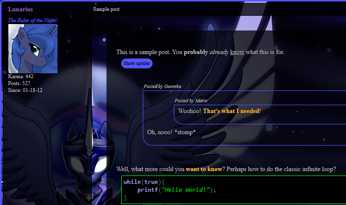 In this specific case, a non-standard font is used, and no fallbacks are provided. The browser selects the universal default, Times New Roman. It's ugly. It's tiny. You don't want to inflict that to people reading your posts. Neither do I. I'm sick of seeing Times New Roman because people can't be assed to make proper CSS font rules. ❹ Please put some effort into making a pleasant layout. I'm kinda sick of seeing layouts that are just a fixed background applied on the whole post table. It looks cheap, can cause readability problems depending on the background chosen, and fixed backgrounds can cause lag. ❺ As said above, avoid fixed backgrounds unless your cool effect absolutely depends on them. Fixed backgrounds require the browser to redraw the page when you scroll, which can lag less performant machines, and is also prone to display problems especially on mobile devices. ❻ This is not related to layouts, but please refrain from altering your profile's background and just the background. On some themes, it doesn't work well. If you really want to customize your profile, either make a full theme, or don't mess with the page background. Relatedly, I have seen many people applying a background to div#body instead of body. This is bad. View the page in a screen wider than 1366 pixels and you'll see why. Thank you. _________________________ Kuribo64 - zrghij |
|
|
Posted on 06-24-14, 01:01 am
|
 Birdo Birdo Karma: 3305 Posts: 1631/2024 Since: 06-28-11 |
For people using images, I recommend you run your .png file here:
https://tinypng.com/ It does a nice job at reducing the filesize, so it makes the page load faster. _________________________ |
|
|
Posted on 06-24-14, 05:49 am (rev. 1 by ImageBot on 11-21-16, 03:00 am)
|
|
I am random… very random.
 Karma: 750 Posts: 529/682 Since: 01-17-12 |
Posted by StapleButter This is an example of result of badly coded custom fonts: In this specific case, a non-standard font is used, and no fallbacks are provided. The browser selects the universal default, Times New Roman. It's ugly. It's tiny. You don't want to inflict that to people reading your posts. Neither do I. I'm sick of seeing Times New Roman because people can't be assed to make proper CSS font rules. Alright, alright. I get it. I fucked up on the fonts. What do you think I should choose as a fair font? Courier New? |
| Tierage |
Posted on 06-24-14, 06:40 am
|
|
Karma: 1733 Posts: 115/658 Since: 05-14-14 |
Posted by Lunarius Posted by StapleButter This is an example of result of badly coded custom fonts: -- In this specific case, a non-standard font is used, and no fallbacks are provided. The browser selects the universal default, Times New Roman. It's ugly. It's tiny. You don't want to inflict that to people reading your posts. Neither do I. I'm sick of seeing Times New Roman because people can't be assed to make proper CSS font rules. Alright, alright. I get it. I fucked up on the fonts. What do you think I should choose as a fair font? Courier New? Nah, I don't think you should use Courier New. I know some fonts that would work REALLY nicely. |
|
|
Posted on 06-24-14, 01:32 pm
|
|
☭ coffee and cream
Karma: 10416 Posts: 1433/2769 Since: 06-26-11 |
|
|
Posted on 06-24-14, 03:34 pm
|
|
I am random… very random.
Karma: 750 Posts: 530/682 Since: 01-17-12 |
Posted by StapleButter I didn't mean that, see my post at Kuribo64. a non-standard font is used, and no fallbacks are provided You're free to use whatever funky font pleases you, but you should always add fallback fonts that look sane. Yeah, I got it. Posted by Tierage Posted by Lunarius Posted by StapleButter This is an example of result of badly coded custom fonts: -- In this specific case, a non-standard font is used, and no fallbacks are provided. The browser selects the universal default, Times New Roman. It's ugly. It's tiny. You don't want to inflict that to people reading your posts. Neither do I. I'm sick of seeing Times New Roman because people can't be assed to make proper CSS font rules. Alright, alright. I get it. I fucked up on the fonts. What do you think I should choose as a fair font? Courier New? Nah, I don't think you should use Courier New. I know some fonts that would work REALLY nicely. What do you have in mind? |
|
|
Posted on 06-24-14, 03:58 pm
|
|
☭ coffee and cream
Karma: 10416 Posts: 1436/2769 Since: 06-26-11 |
|
|
Posted on 06-24-14, 04:07 pm
|
|
I am random… very random.
Karma: 750 Posts: 531/682 Since: 01-17-12 |
How large is your screen?  Anyways, I disabled fixed positioning, but I do not know where is the best part since it does not cut off for me. Perhaps, positioning the image to the left would work? Anyways, I disabled fixed positioning, but I do not know where is the best part since it does not cut off for me. Perhaps, positioning the image to the left would work?I allow you to fix the positioning of the image since I don't have a huge resolution like you. |
|
|
Posted on 06-25-14, 01:17 am
|
 Super Mario Super Mario( ͡° ͜ʖ ͡°) Karma: 10021 Posts: 4039/4458 Since: 06-08-11 |
Its your job to make sure your lsyout works on all resolutions. Not the admins'.
You can simulate big resolutions by zooming out in your browser. |
|
|
Posted on 06-25-14, 01:33 am
|
|
☭ coffee and cream
Karma: 10416 Posts: 1438/2769 Since: 06-26-11 |
Or alternately:
a) use a tiling background b) make your background fade nicely to a plain background color on the edges c) use CSS background sizing to stretch the background. It'll look like shit on really huge resolutions, but it's better than having it cut off. _________________________ Kuribo64 - zrghij |
|
|
Posted on 06-25-14, 04:06 am
|
|
Doesn't actually do anything.
 Karma: 3022 Posts: 390/653 Since: 10-22-12 |
Posted by Tierage Nah, I don't think you should use Courier New. I know some fonts that would work REALLY nicely. You should list some. ♪♫♩♬ |
|
|
Posted on 06-25-14, 01:39 pm
|
|
☭ coffee and cream
Karma: 10416 Posts: 1440/2769 Since: 06-26-11 |
|
|
Posted on 06-25-14, 04:37 pm
|
|
I am random… very random.
Karma: 750 Posts: 533/682 Since: 01-17-12 |
| Minecrafter4718 |
Posted on 09-15-14, 05:37 pm, deleted by
|
Pages: 1